
You have a website. You're fairly sure it's not doing much for you. And no one ever taught you how to check whether that hunch is right, which isn't entirely an accident — there's a whole industry that does better when you stay unsure.
So let's fix the unsure part.
A website has exactly one goal: move a person from "who is this" to "let's talk." Everything else, the design, the speed, the SEO, the words, exists to serve that purpose. When people ask me if their site is "good," what they're really asking is, "Is my website helping my business, or quietly getting in the way?" That's a question you can answer yourself, today, without logging into anything or paying anyone. You just need to know where to look.
Before we start, one thing so we're clear: this isn't an anti-SEO post. SEO is real, the technical details matter, and they're worth getting right. What I'm against is the mystification or over-complication of the practice, turning a handful of practical things into a black box so it can be sold back to you at a markup. So here is the box, opened wide. Take as much as you want. Three questions, in order, easiest to hardest.
The checklist:
- The Core (website speed, metadata, etc.)
- The Aesthetics (is it ugly, or is it broken?)
- The Honest Look (would you show your website off, or explain it away?)
Answer those honestly and you'll know more about your website's health than most owners ever bother to learn. Let's take them one at a time.
1. The Core (speed and the basics)
This is the section everyone wants to skip and nobody should. It's also the most fixable. None of what follows requires you to write a line of code, none of it depends on which platform your site is built on (every major one, WordPress, Squarespace, Wix, the rest, lets you edit and manage these settings), and most of it you can do yourself this week. We'll go one item at a time, and each one ends with how to actually fix it.
First, the one idea that makes every item below make sense. Google, Bing, and other search engines aren't really grading your website. They're grading whether your website is the best answer for the visitor who just searched. Not a metric, a real human being, the one most likely to give them what they came for without making them work for it. Everything a search engine measures, speed, structure, how the page reads, whether it holds together on a phone, is a stand-in for one question: is this a genuinely good experience for the person on the other side? That's worth sitting with, because it's the key to this entire post. Search engines aren't rewarding tricks. They're trying to find the site that serves that visitor best, because surfacing good results is the whole reason anyone uses them in the first place. So the "SEO" thing and the "be good to your visitor" thing aren't two jobs. They're the same job wearing different clothes. They will be the same job in every section below. That's not a coincidence. It's the point.
One quick note before we dig in. From here on I'll mostly just say "Google," because it's the one everybody knows and saying "search engines" every other sentence gets old fast. But nearly everything here works the same way on Bing, DuckDuckGo, and the rest. They're all chasing the same goal, so when you read "Google," picture whichever one you like.
Now the checklist.
Website speed
The fastest way to judge your own speed is to stop testing it the way you built it. You probably check your site at your desk, on fast office wifi, where everything feels fine. Your customers do not. So open your site on your phone, off wifi, on plain cell signal, the way a real person hits it from a parking lot or a waiting room. Count the seconds. If you're waiting, so are they — except they have somewhere else to be and a competitor one tap away.
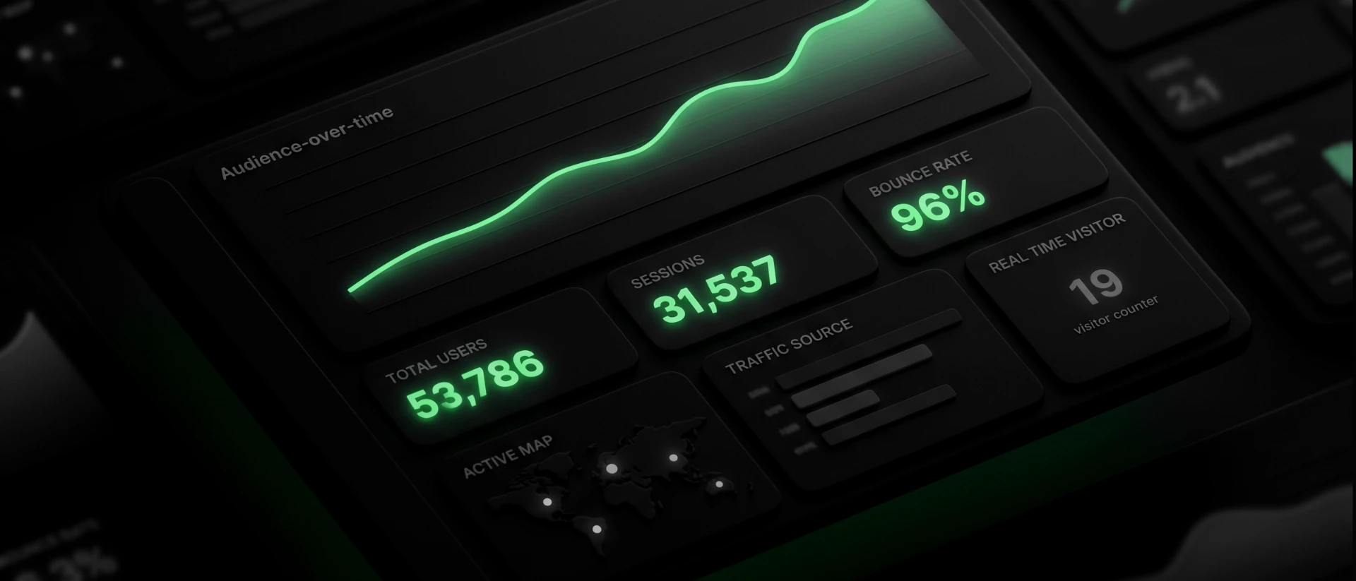
Speed isn't a vanity number. Google bundles it into a set of measurements it calls Core Web Vitals and folds it directly into how you rank. It's not the biggest factor (quality, relevant content still wins) but it works as a tie-breaker: when your page and a competitor's are otherwise evenly matched, the faster one gets the nod. And the reason is the same one from a moment ago. A slow page is a worse experience for the person waiting on it, so Google treats it as a worse result.
If you want an actual number instead of a gut feel, run your site through Google's free Page Speed Insights tool. You paste in your web address and it grades you, on mobile and desktop separately, and tells you specifically what is slowing you down. It's the same data Google itself looks at. Two culprits account for the large majority of what it will flag, and both are yours to fix.
Image and video compression. This is the number one cause of slow small-business websites, full stop. Photos exported straight off a camera or a phone are often five to ten times larger than the web actually needs. A single oversized image in your header can do more damage than everything else on the page combined. The browser has to download that whole heavy file, on top of everything else the page is already pulling in (the rest of your images, fonts, code, and so on), before the visitor sees a finished page. On a phone signal, fighting for the same limited bandwidth, that's the wait that loses them. The fix is genuinely easy: before you upload an image, run it through a free compression tool (TinyPNG and Squoosh are two that cost nothing and need no account). They shrink the file size dramatically while keeping the image looking identical to the eye. For images already on your site, swap the heavy ones for compressed versions. This one step alone fixes most speed problems for most sites.
If your site leans hard on imagery, where a photo needs to stay crisp and you want to control exactly how far the compression goes, you'll want a hand on the dial rather than an automatic tool. A proper image editor gives you a quality slider so you can walk right up to the edge of small-and-sharp without tipping over into muddy. Affinity (now owned by Canva and free for individuals) is a full professional editor at no cost, and Photoshop has the same quality control if you already pay for it. Same idea as the quick tools, just with you deciding where the line sits instead of an algorithm guessing.
Video deserves its own harder question, because it's showing up on more and more sites and it's far heavier than any image, often by a wide margin. Before you even get to compressing it, ask whether it earns its place at all. An autoplaying background video in your header looks impressive on your fast office connection and quietly punishes every visitor on a phone. So first decide: is this video doing real work, or is it decoration that's costing you visitors? If it earns its place, host it somewhere built for it (YouTube or Vimeo, then embed) rather than uploading the raw file straight to your site, and avoid autoplaying heavy video on the pages that matter most. The question is the same one running through this whole post: does this serve the person on the other side, or just look good to you?
Plugin bloat. Every plugin or add-on you install loads its own little package of code onto your site, and most of them load on every page, whether that page uses them or not. Over a few years a site quietly accumulates a dozen of these. A form tool you tried once, a popup you ran for a holiday sale, three things that do roughly the same job. Each one taxes every visitor. The fix is an honest audit: go through your installed plugins and ask of each one, "do I actually use this, right now?" Deactivate what you don't, test that nothing breaks, then delete it. Fewer moving parts means a faster site and, as a bonus, fewer security holes.
If someone tries to sell you a whole new website to solve "it's slow," you now know enough to ask why a round of compression and a plugin cleanup wouldn't fix it first. Often that's all it takes.
But sometimes, the hard truth is that it genuinely is the site itself. The build is too old, or too dependent on heavy plugins it needs just to function properly, and patching it costs more than it is worth. In that case, the honest answer is "yes, this one needs a rebuild." The point isn't that a rebuild is always a scam. It's that you should understand why it's being recommended before you pay for one, and now you can ask.

Page titles
A page title is the official name of a page. It's the text that shows up in the browser tab, and more importantly, it's the big clickable headline Google displays for your page in its results. It's one of the very first things Google reads to understand what a page is about, and one of the first things a human reads when deciding whether to click you instead of the result above you.
The mistake a lot of website owners make is leaving these blank, generic, or identical across the whole site — so every page just says the business name, "Home," or "Services." None of that gives a searcher a reason to choose you.
The fix is straightforward. A good title describes what that specific page actually offers, in plain words, using the terms a real person would type when they're looking for it. It should be descriptive and to the point. Not "Home" but "Custom Cabinetry in Colorado Springs." Not "Services" but "Kitchen & Bath Remodeling Services." You can tack the business name on the end if the title is short enough to fit it, but the descriptive part comes first. You'll find the field to edit this in your site builder's page settings, usually labeled "SEO title" or "page title." Lead with the words a person would actually search for, keep it under about sixty characters so it doesn't get cut off, and make each page's title different from the others. Through all of it, remember what you're really doing: not feeding a machine, but writing a few words a real person will read and decide on. The title is a tiny first conversation with someone you'd like as a customer.
Once you've got that down, here's a free way to sharpen it: pay attention to your own behavior the next time you search for something. You type a need into the box, you scan the results, and you click one. The first reason is that its wording matched what you were after. But among the handful that all looked relevant, something about the wording of one made it the obvious pick. That instinct you just used, scanning and choosing, is the exact instinct your customers use on your listing. So write the version you'd want to click if you were the one searching. Whatever catches your eye is almost certainly catching theirs, because they came looking for the same thing.
Meta descriptions
The meta description is the short paragraph of text that appears under your page title in search results. If the title is the hook, this is the line right behind it that backs the hook up. Think of it as your elevator pitch: the couple of lines a person reads right before deciding whether to click. Search engines don't use it to rank you directly, but sitting there under your title against a list of competitors, it's often the bit that tips the choice your way. A good one is the difference between showing up and getting chosen.
Here's the nuance most advice skips: Google rewrites your description a lot. When someone searches a very specific phrase, Google will often pull whatever line on your page answers that exact phrasing best, and swap it in. That sounds like an argument for not bothering. It isn't. A well-written description acts as a seed: when it's clear and genuinely matches the page, Google is more likely to use yours as-is, which hands you control of the pitch. And even on the searches where it gets overridden, your version still signals your intent and shapes what gets shown. Leave it blank and you've handed the wording over completely, to a machine stitching together fragments of your page. So the honest takeaway is simple: write one anyway, at least on the pages that matter, and never paste the same description across every page, which just muddies which one is the right answer.
When you do write one, write it for the person, not the algorithm. A clear sentence or two that tells someone what they'll get and gives them a reason to choose you, the way you'd answer "why should I pick you" out loud. Skip the keyword stuffing; a wall of repeated phrases reads like a robot wrote it and wins no one over. You'll find the field in the same settings as the title, usually labeled "meta description," and aiming for roughly 150 characters keeps it from getting cut off.
Image alt tags
An alt tag (short for "alternative text") is a short written description attached to an image. It's a line of text that says what the picture shows. The reason it matters most is the one worth pausing on. A screen reader, the software a blind or low-vision visitor uses to navigate the web, reads that text aloud. So your alt text is how someone who can't see the photo still gets to experience what's in it. Picture how you'd treat a visually impaired customer who walked into your shop. You'd describe what's in front of them, point them where they needed to go, make sure they got the same welcome as anyone else. You wouldn't think twice. Alt text is that same instinct, online. It's how you offer that person the same care when they visit the version of your business that lives on a screen. You're not checking a box. You're holding the door open so practically anyone can come in and get the same experience.
And here's the bonus, the part that flows straight out of doing the right thing. When you make your site work for everyone, you've created a better experience, and that's exactly what Google is built to reward. On top of that, Google can't actually "see" an image any more than a screen reader can, so your alt text is also how it learns what the picture is, which lets your photos surface in image search and helps it make sense of the page as a whole. Describe an image well for a person who can't see it, and you've described it well for Google in the same breath. Taking care of your visitors and ranking well aren't a trade-off. One produces the other.
And the best part is how little it asks of you. Most sites have nothing here, or junk like "IMG_4032" that helps no one. That's not an exaggeration: the WebAIM Million study, which audits the top million home pages every year, found more than half of them have missing alt text. So the person you're picturing isn't just left at your door, they're left at most doors on the web. Which means getting this right is a quiet way to stand out. All you do is find the field, it's labeled "alt text" or "alternative text" in your image settings on basically every platform, and write what the picture actually shows. The way you'd say it to someone on the phone who can't see it. "Newly remodeled kitchen with white oak cabinets and a marble island." That's it. Not a pile of keywords, just the truth of what's there. A minute per image, and someone who'd have been shut out gets to see your work after all.

JSON schema
This is the one that sounds the most technical, and honestly, it used to be a slog even for the people who write code for a living. Nobody's first love is hand-writing structured data. But thanks to AI, it's become one of the most approachable items on this whole list. Schema (specifically a format called JSON-LD) is a small block of structured code that explicitly tells Google what your business is: your name, that you're a local business, your address, hours, phone number, the services you offer, your reviews. Your normal page tells Google all this in human sentences and hopes it understands; schema spells it out in a format built for machines, leaving nothing to guesswork. It's what powers those rich search results where a business shows up with star ratings, hours, and contact details right there on the page.
Here's why it earns a spot on a list for non-coders: you don't write it anymore. You ask for it.
Open any AI assistant and tell it about your business in plain language. Something as simple as: "Write the appropriate JSON-LD schema for my business," then describe what you do, your name, what kind of business it is, your address if you have a storefront, phone, hours, and the services you offer. Let it pick the right format; that's its job, not yours. It hands back a finished block of code that, to most people, looks like chaos: a jumble of brackets, quotes, and colons. That's normal. You're not meant to read it, and you don't need to understand a line of it. It isn't written for you. It's written for Google.
The only part left is finding where it goes, and the good news is platforms have made this easier than it used to be. Start by poking around page settings for anything with the word "schema" in it. A lot of site builders and SEO plugins now have a dedicated spot built just for this, where you drop the code in and they handle the rest. If you find that, you're done; paste it there and save.
If you don't see a schema option, the fallback is a field for custom code in the page or site "head," sometimes labeled "custom code," "embed," or "header code." And if you can't spot either one, just ask the same way you got the code in the first place: "where do I add schema (or head code) in [your platform]?" The answer is a sentence away. One small thing to ask for while you're at it: tell the assistant to give you the code "ready to embed in a web page." Some tools hand back the raw information without the little wrapper that makes a website actually read it, and that one phrase saves you the confusion of pasting something in and wondering why nothing happened. Either route ends the same place: you've handed Google a clean, plain-spoken description of exactly who you are and what you do.
Ten minutes, start to finish, and you've given Google a snippet that spells out who you are in the structured form it reads best, no coding required.
The obvious one... page content
Everything above is about helping Google find and understand your page. None of it matters if the page itself has nothing real to say. This is the part that's so obvious it gets skipped, and after years of doing this, I'd argue it's the most important piece of SEO there is: the actual words on your pages. Everything else is plumbing that carries people to the content. If the content doesn't land, the plumbing was for nothing.
Here's the part that makes it easier than it sounds: you already know your content, because you live it every day. Think about how you talk to a customer who walks in or picks up the phone. The questions they always ask. The worries you talk them through. The thing you say that makes them go, "oh, that's the difference, that's why I'd go with you." That is your content. You're not inventing something new for a website. You're writing down what you already say, so it's there for the next person before they've even called.
A fair warning, though: this is the one item on the list that isn't a quick fix. Speed and schema you knock out in an afternoon. Content is a marathon, not a sprint, and it's never quite finished, because your business keeps moving and so should your words. Don't let that scare you off. You don't sit down and write the whole site in one heroic weekend. Twenty minutes a day, one page or one question at a time, and in a month you've built something most of your competitors never bothered to. You'll miss days. Life happens, and one skipped afternoon doesn't undo anything. The only thing that actually sets you back is letting a missed day become a missed month, so when it happens, just pick it back up. Momentum matters more than perfection.
So when you write a page, answer the questions your customers actually ask, in the words you'd actually use. Explain what the page is about, of course. But explain it like a person, not like someone trying to trick a machine. When you talk to a potential customer, you don't whisper "remodeling" twenty times under your breath. You answer their question. Write the page the same way. The businesses that win here aren't the ones who gamed the keywords. They're the ones who sounded like themselves, because that's what a real person on the other end is actually looking for.

2. The Aesthetics (is it ugly, or is it broken?)
Pull your site up on your phone and look at it like you're seeing it for the first time. Buttons cut off at the edge. Text running off the screen or stacked into a weird narrow column. A menu that fights your thumb. Images squished out of shape. You don't need a design degree to feel when something is off. If it feels janky to you, it feels janky to the person deciding whether to trust you with their business.
This one carries more SEO weight than people realize, and here is the part that surprises most owners: Google completed its move to "mobile-first indexing" back in 2024, which means it now judges your site by its phone version, not its desktop (computer) version. Every site, no exceptions, even if most of your visitors are on a laptop. Google made this switch for a blunt reason. The majority of web traffic is now mobile, over sixty percent globally and higher than that for local and consumer businesses. Google decided to grade your site the way most people actually see it. So a beautiful desktop site that falls apart on a phone isn't a small cosmetic problem. The broken version is the one Google grades, and it's grading the broken version every time.
What you can do, and where it crosses into needing help. Some of this is genuinely yours to fix, especially if you manage your own site. If your theme is out of date, update it. A lot of mobile breakage is just an old theme that predates how phones render things now. If a button label is so long it wraps and breaks the layout, shorten it; "Contact" beats "Get In Touch With Our Team Today" in nearly every way that matters, on a phone most of all.
But here is the honest truth, and I would rather tell you than pretend everything is a DIY fix: real layout problems live in the code. The technical word for a site that reshapes itself cleanly across screen sizes is responsive, and making a site responsive isn't something you can do from the dashboard. That's fine. The goal here was never to turn you into a developer. The goal is to make you impossible to bluff. So instead of walking into a meeting and saying "my site looks weird on my phone," you can now say: "the navigation isn't responsive on mobile — looks like a styling issue in the layout." That sentence does two things. It tells the developer or designer you're not guessing, and it tells you something too: this is a standard fix, not a heroic custom rebuild, so if it gets quoted to you like a moon landing, you know to ask why.
3. The Honest Look (would you show your website off, or explain it away?)
This is the one nobody else will ask you, and it's the most important of the three.
Forget the metrics for a moment. Would you send your website to someone whose opinion you actually respect, a mentor, a sharp friend, a competitor you admire, without a caveat? Without the little "I know, I know, it needs work" you say before they can? If the honest answer is no, you've learned something no analytics dashboard would have told you.
This matters for a reason that's going to sound almost too neat, so stay with me. Google has spent twenty years getting better at one thing: detecting genuine quality, content that's useful, made with care, clearly built for a person rather than for a crawler. It does this because surfacing quality is what keeps people coming back to Google in the first place. Now here's the part that connects: that gut sense of whether you'd stand behind your own site is itself a quality detector. It's you, the person who knows the work best, judging whether it's actually good. And good is the exact thing Google is trying to measure from the outside. You're both aiming at the same target from different angles. So when you genuinely believe in your site, you're usually not far from what the engine is rewarding anyway. Build the honest, quality experience and you've optimized for the engine almost by accident, because the engine is just a machine built to find what people actually value.
What you can do about it. Start where it's most concrete and climb from there. First, the photos. Imagery is half the battle, and a single dated, pixelated, or obviously-stock photo can drag a whole page down with it. Swapping bad images for good ones is the fastest visible upgrade most sites can make. Then go a layer deeper into your words. We covered writing your content earlier, the actual answers to the questions customers ask. This is the gut-check on top of that: does the whole thing sound like a person, like you, or like it was assembled from the same beige phrases every business in your category uses? Build the actual voice. Then the headings: most are pure utility, "Services," "About," "Welcome," when they could be saying something true and specific instead. A vague heading is prime real estate sitting empty; put it to work.
And the hardest, most freeing thing in this entire post: if you cannot stand behind your site, stop pouring money into driving traffic to it. This is the most expensive mistake I watch business owners make. They pay to send more and more people to a foundation they would replace if they were honest with themselves. Fix your online presence first. Whatever that takes, a fresh theme, a full rewrite, or bringing in a professional designer and developer, do what you need to do to get to a site you'd be proud to stand behind. This is your storefront. It should be one you're glad to point people toward. Optimizing something you do not believe in just means paying to scale a problem.
Think of your website as your easiest employee. It works around the clock, never calls in sick, and asks for almost nothing in return. But like any employee, it does its best work when you give it a little attention. You wouldn't ignore a good hire for six months and expect the same results they gave you right after their review, and your site is no different. The difference is it only needs you on your terms: a tweaked phrase here, a fresh photo there, two minutes between other things.
That's the whole secret, if there is one. None of this requires you to become technical. It requires you to care about the person on the other end, which you already do, or you wouldn't have read this far. Pick the one thing that felt most true as you read. Fix it this week. Then the next. A site that moves a stranger from "who is this" to "let's talk" isn't built in a weekend. It's tended, a little at a time, by someone who gives a damn.
Want to go a little deeper?
This part is optional, and skipping it costs you nothing. The three questions above are the real meal. But if you have analytics installed and have never once opened it, this is your invitation. You're sitting on a tool that can tell you things, and nobody ever showed you how to read it. Here's your first look.
Full honesty first: I'm not a dashboard person. Living in them feels a little soulless to me, because the whole job of a number is to flatten a living, breathing visitor into a statistic, and this entire post has been about not doing that. So I'm not going to hand you forty metrics. I'm going to give you the three I actually glance at, and then tell you the one thing they're genuinely good for.
Views (sometimes called users or sessions) is just how many people showed up. Trend matters far more than the raw count. Is it climbing, flat, or sliding? And give it real time before you judge it. Everything we did above builds what's called organic traffic, the people who find you naturally through search rather than through ads you paid for, and organic is a slow burn. It compounds over months, not days. So don't compare this week to last week and panic. Compare where you are now to six months ago. That's the window where real work actually shows up, and that single line tells you more than any other number on the page.
Average session duration is how long people stick around. A few seconds means they landed, recoiled, and left, something at the top of the page pushed them away before you got a chance. Longer means something's holding them. Pair it with views and you've got a rough pulse: are people arriving, and do they stay?
Event count only matters when you've set it up to track a specific action you care about, a contact form sent, a button clicked, a number called. If you have it, it answers the only question that ultimately counts: did the visit turn into something real?
Here's the honest limit on all three: they're a pulse check, not a diagnosis. They tell you whether something's working, never why. The why is back up in everything we already covered, the speed, the words, whether the site holds together on a phone. Numbers point you at which room to look in. They don't tell you what's wrong once you get there. And the second you start treating a rising number as the goal itself, rather than a sign that real people are being served, you've quietly slipped back into optimizing for the machine instead of the human. Watch the trend, then go look at the actual experience.
But there's one reason this is worth the bother, and it's the reason a lot of business owners eventually teach themselves this the hard way. If you're ever paying someone for ongoing work, a marketing retainer, an SEO firm, a freelancer, these numbers are how you check that you're getting something for it. I've heard the same story more times than I can count: months of invoices, a paragraph reworded here and there, and when they ask what's actually being done, the answer is a fog, "fixing technical SEO," "auditing keywords." Vague activity, no visible result. You don't need to understand the jargon to call it. You open your own analytics and ask one plain question: are more people showing up than six months ago? Real work eventually moves that line. If it's flat while the invoices aren't, the jargon was the product. The number cuts straight through the fog, which is exactly why some people would rather you never look at it.
A few common questions about website SEO
Why is my website so slow? About eighty percent of the time it's one of two things: images way bigger than they need to be, or a pile of plugins all loading at once. Both are fixable without a rebuild, and usually without paying anyone. Start with the images; that alone fixes most of it. The other twenty percent, in my experience, is just a site that was built poorly underneath, and that's a harder conversation.
How do I know if my website is actually any good? Forget how it looks to you after staring at it for a year. Ask whether it moves a stranger from "who is this" to "let's talk." If it loads fast, holds together on a phone, and you'd send the link to someone you respect without a single "I know, I know," you're already most of the way there.
Does my site really need to work on mobile if my customers are on computers? Yes, and I know that's annoying. Since 2024 Google grades your site by its phone version, full stop, no matter where your visitors actually are. A site that falls apart on a phone can sink your rankings even for the desktop crowd you care about. There's no opting out of this one.
Isn't SEO just stuffing in keywords? That playbook died years ago. Cramming the same phrase into every paragraph doesn't fool anyone anymore, least of all Google, which got very good at spotting genuine, useful writing. Write like a human talking to a customer. That's the whole trick, and it's harder to fake than it sounds. More on that in Part II.
How long before any of this actually works? Longer than you'd like. Organic traffic is a slow build, it compounds over months, not days. Don't judge it week to week. Check where you are against six months ago, and be patient with the curve.
Can I just do all of this myself? Most of it, yes, that's the whole point of this post. Compression, titles, descriptions, alt text, schema, your own words, all of it is yours to handle. The one thing that genuinely needs a pro is a layout that's broken in the code. Everything else, you've got.